Sunshell Packaging


Sunshell Packaging
Brainstorming
The first step in the design process was brainstorming ideas for the children's product packaging, focusing on both functionality and environmental awareness. I wanted to create a design that would resonate with both children and parents while conveying a message of sustainability. During this phase, I thought about symbols that represent protection and the environment, which led me to the idea of using a turtle as a central motif. Turtles are often associated with nature and are symbolic of environmental preservation, making them a perfect fit for the project.
Research
To build a solid foundation for the design, I conducted research on turtles, specifically focusing on their shells, which serve as a form of protection from the sun. I found that turtles’ shells not only offer physical protection but also represent a shield against the elements, an idea I wanted to incorporate into the packaging. I also researched eco-friendly packaging materials and methods to ensure that the design was aligned with the environmental message.
Sketching
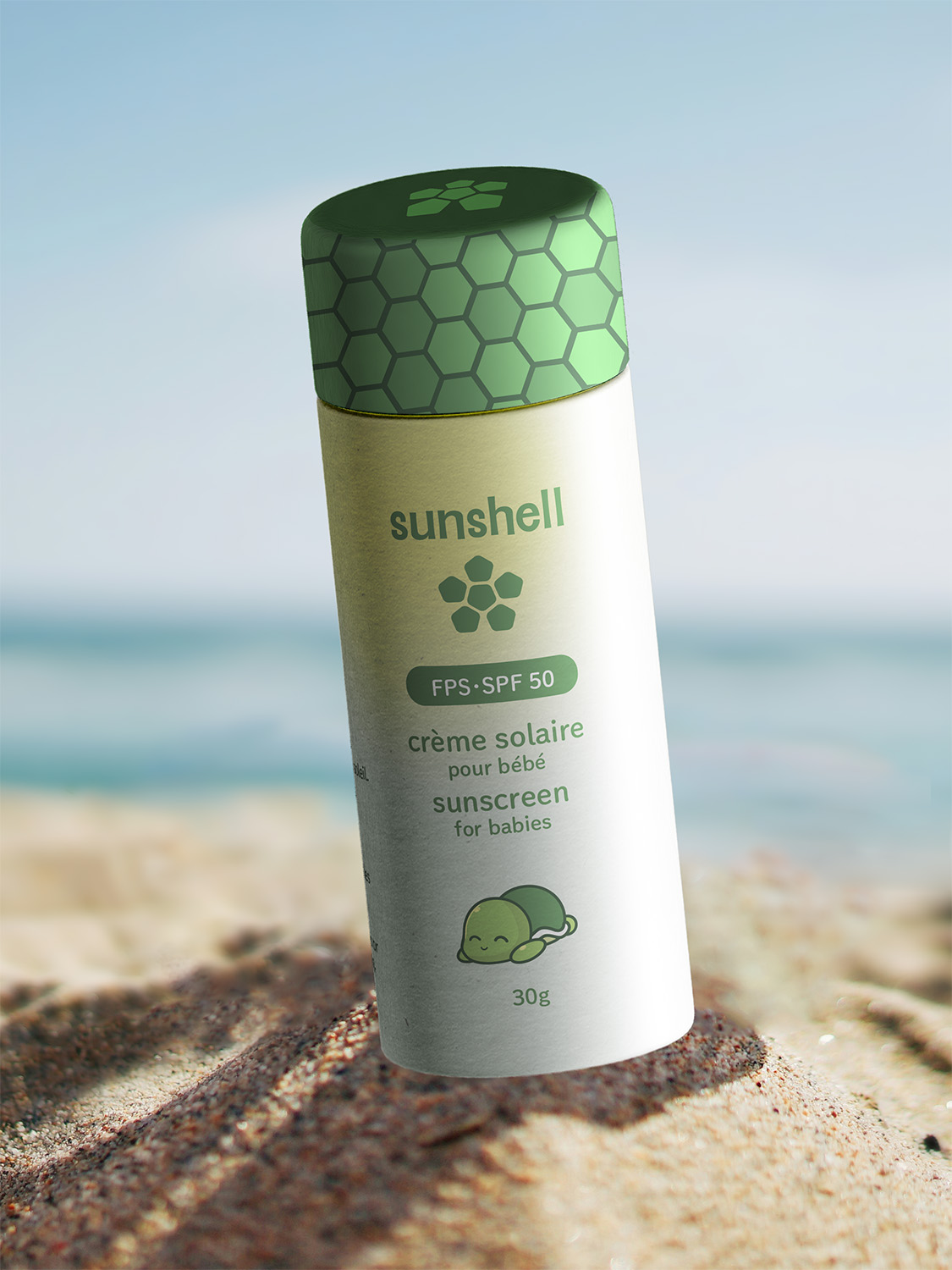
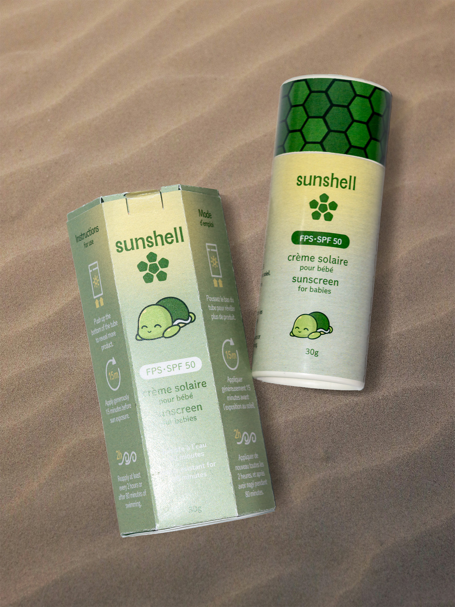
With the turtle shell as the central concept, I began sketching ideas for the packaging. I experimented with the cardboard tube as the turtle's shell, focusing on how to integrate the cap as the turtle's protective shield.
Design
Building on my sketches, I developed the design concept, integrating the turtle shell as the central element. I wanted the cap to resemble a shield, symbolizing the turtle’s protection. I also worked on balancing the playful, illustrative style of the design with the practical needs of the packaging. The bilingual requirement became a key consideration at this stage, as I needed to ensure that both languages were presented clearly and legibly. I chose to place the English text on one side of the packaging and the French text on the other, keeping them visually balanced while maintaining readability.